A Year in Review
December 26, 2023 - bobatealee
Tags:
development
fun
Hi there! What a year. We have lots of stuff to go over!
Just a few days ago, we released our latest update: the 2.1.3 Patch! It comes complete with weapon rebalances and reworks, visual overhauls, and plenty of brand new festivities. As usual, a few members of the team decided to make a fun little preview video. This was initially uploaded to Twitter or X or whatever, but now you can view it here on the blog or on YouTube!
Speaking of the blog, we haven't forgotten about our community roundups! We've taken a look through all of your awesome submissions, and plan to feature submissions each month, starting in 2024! We're always looking for community content to feature on our socials, so please be sure to email us if you'd like the chance to have your stuff shown off!
Last but not least, we would like to thank everyone in the community for all of their kind comments and feedback this year, and everyone who made the Fight or Flight update possible. It's been a very long road. All that leaves now is the eternal question: when is the next update? And the answer is... soon! Very soon! Early 2024 soon! We won't reveal too much yet, but we have been working on some pretty interesting stuff, and we can't wait for everyone to get their hands on it.
That's all for now. Happy holidays, and here's to 2024!
A Shiny, New(-ish) Look
December 3, 2023 - Waugh101
Tags:
development
Heyo,
The imminent 2.1.3 patch is shipping with a new default look for our lighting! This new shading method utilizes Full Lambertian shading, causing more abrupt and noticeable shadows on player models and Engineer buildings.
Players might recognize this lighting style from the promotional shots given out to journalists shortly before Team Fortress 2 went gold. Changed right before TF2’s official release in 2007, TF2 Classic has restored and modified it to make it usable in 2023. Our version is slightly altered to maximize player visibility, and can be toggled at any time in video settings, or by using the ‘tf2c_new_lighting’ console command.
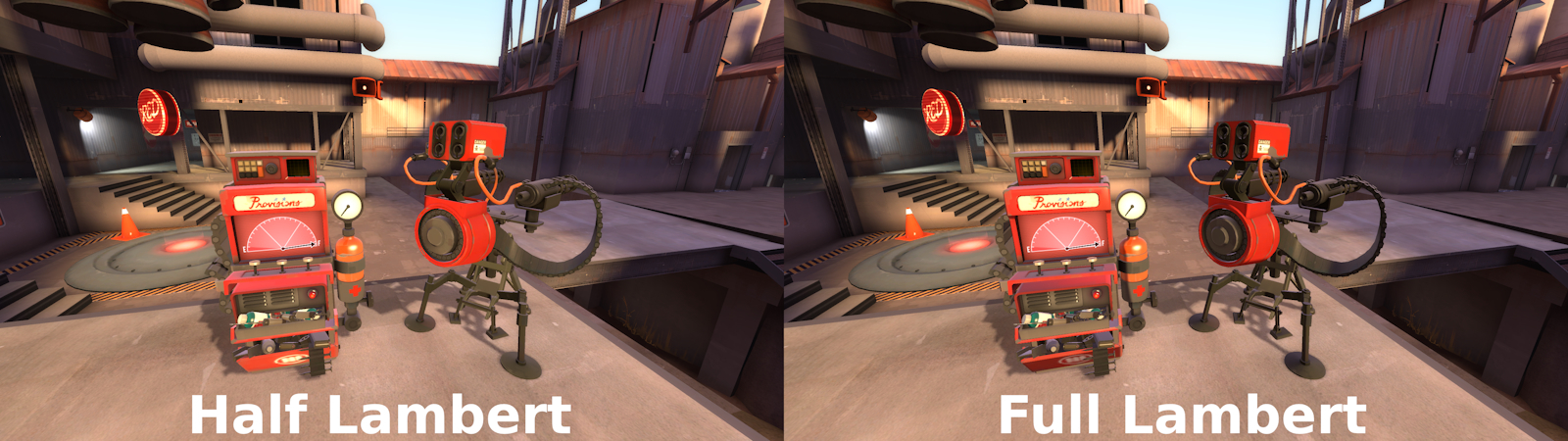
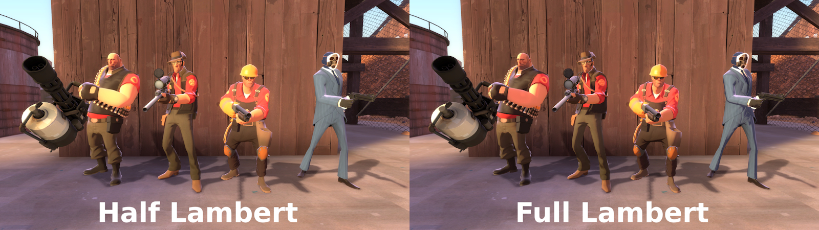
We find this shading helps our visuals feel even more illustrative and brings the game even closer to the work of its artistic inspirations, like J.C. Leyendecker. We hope you enjoy this refined look for our characters!
The imminent 2.1.3 patch is shipping with a new default look for our lighting! This new shading method utilizes Full Lambertian shading, causing more abrupt and noticeable shadows on player models and Engineer buildings.
Players might recognize this lighting style from the promotional shots given out to journalists shortly before Team Fortress 2 went gold. Changed right before TF2’s official release in 2007, TF2 Classic has restored and modified it to make it usable in 2023. Our version is slightly altered to maximize player visibility, and can be toggled at any time in video settings, or by using the ‘tf2c_new_lighting’ console command.
We find this shading helps our visuals feel even more illustrative and brings the game even closer to the work of its artistic inspirations, like J.C. Leyendecker. We hope you enjoy this refined look for our characters!
The Making of KOTH Frigid
September 29, 2023 - Waugh101
Tags:
development
We like to start our maps out by basing them around clear, distinct ideas. Usually, our maps are made with the intent of improving upon a perceived flaw with an existing map or mode, or are just built around a strong and interesting central premise. In the case of Frigid, it was initially intended to be a Four-Team, three-point Domination map. However, as the layout came together, the central arena started looking more like a KOTH map. It was decided very early on (before the layout was even complete!) to scrap the other two points and instead focus solely on the central point. This change was primarily made to reduce development complexity, and had the added benefit of introducing a new gamemode to the Four-Team map pool, which is something we’re always interested in.
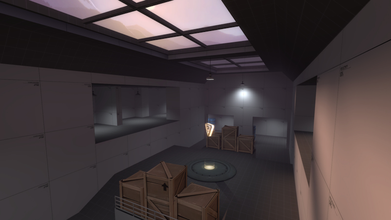
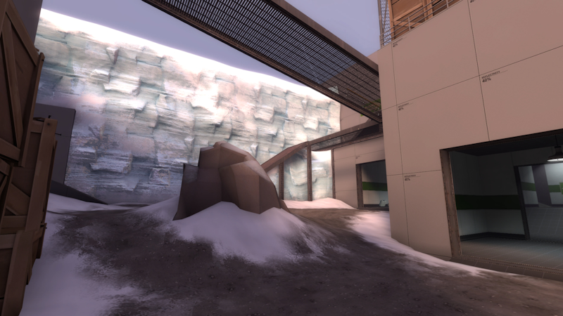
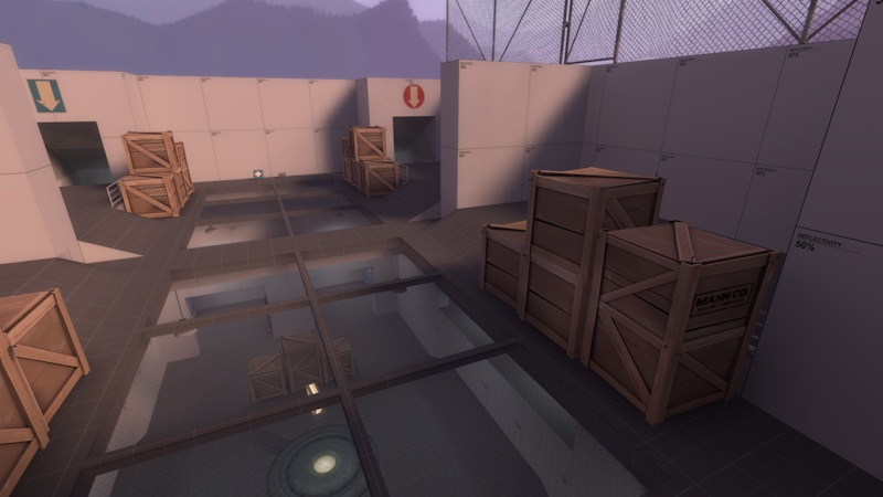
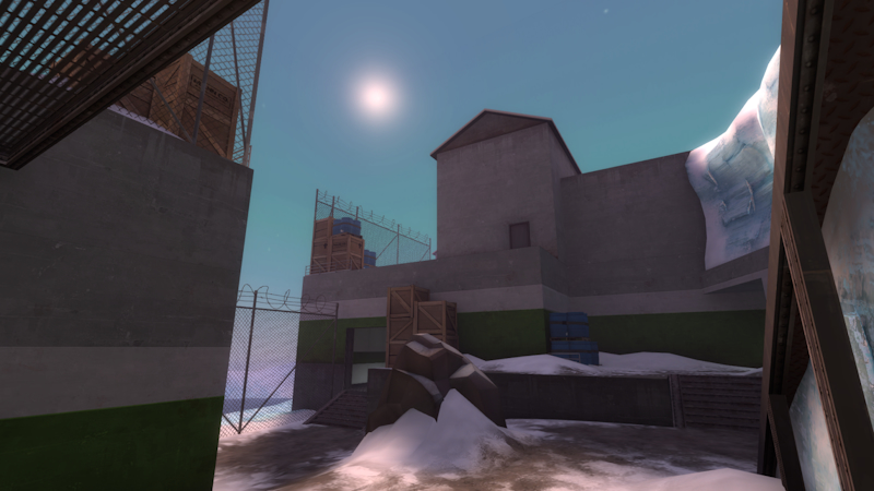
With this new gamemode variant also came a new environment theme. The Arctic theme was chosen so we could try a style that isn’t often seen amongst TF2 environments. There’s plenty of snowy maps, but not many that go the extra mile with the icy cliffs and wide-open expanses that you might expect from the Arctic. As with existing environment themes, the Arctic theme carried the advantages of providing an immediately recognizable setting. Importantly for our limited development resources, it didn’t require a large amount of new assets to bring to life, too. It also allowed for similar styles of industrial structures seen in other maps, which helps to maintain the game’s visual identity. As with the alpine theme, we’ll be looking for new spins to put on it with future levels.
The architectural style itself developed in multiple ways as well- originally intended to be much more Brutalist, imposing, and neutral-oriented, it was slowly worked into the current, more industrial research station aesthetic the map has today. As well as the overall style shift, there were also smaller shifts as the map was developed alongside our Four-Team architecture guidelines that put it more in line with what we expect from Four-Team maps.
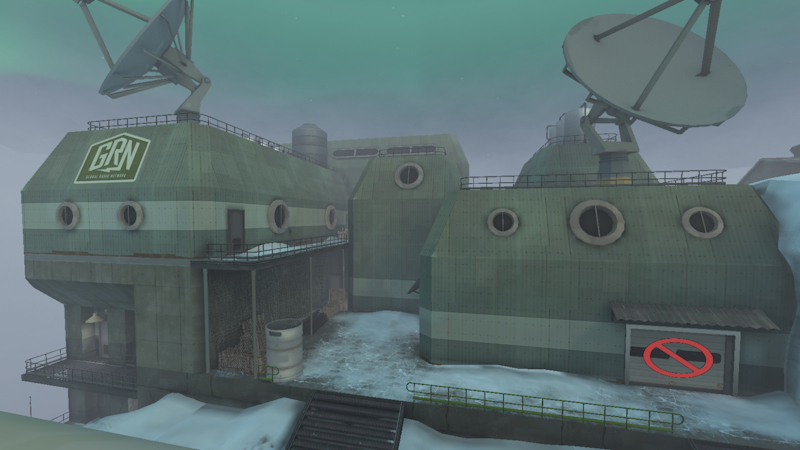
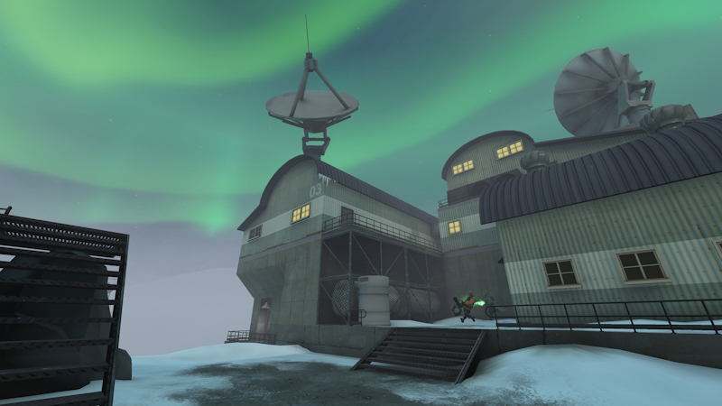
Notice the shift from pure concrete to a mix of somewhat more setting-appropriate materials. From there, the move away from trapezoidal shapes to more grounded and rounder ones.
We thought it might prove fun to provide some development insight through our blog like this. We have more ideas for future topics that we look forward to sharing soon!
The map's early versions
With this new gamemode variant also came a new environment theme. The Arctic theme was chosen so we could try a style that isn’t often seen amongst TF2 environments. There’s plenty of snowy maps, but not many that go the extra mile with the icy cliffs and wide-open expanses that you might expect from the Arctic. As with existing environment themes, the Arctic theme carried the advantages of providing an immediately recognizable setting. Importantly for our limited development resources, it didn’t require a large amount of new assets to bring to life, too. It also allowed for similar styles of industrial structures seen in other maps, which helps to maintain the game’s visual identity. As with the alpine theme, we’ll be looking for new spins to put on it with future levels.
The architectural style itself developed in multiple ways as well- originally intended to be much more Brutalist, imposing, and neutral-oriented, it was slowly worked into the current, more industrial research station aesthetic the map has today. As well as the overall style shift, there were also smaller shifts as the map was developed alongside our Four-Team architecture guidelines that put it more in line with what we expect from Four-Team maps.
Evolution of Frigid's visuals
Notice the shift from pure concrete to a mix of somewhat more setting-appropriate materials. From there, the move away from trapezoidal shapes to more grounded and rounder ones.
We thought it might prove fun to provide some development insight through our blog like this. We have more ideas for future topics that we look forward to sharing soon!
 Oldest
 Older
Older