Refining Our Four-Team Architecture
March 11, 2023 - Waugh101
Tags:
development
Heyo,
As more Four-Team maps have been worked on, both internally and externally, we thought it important to really nail down each team’s style of architecture. As you might imagine, though, the over-a-decade of assets and precedent designed specifically around the existence of only two teams made this a challenging feat. Some of the earlier ideas for the YLW and GRN teams’ architecture revolved around more specific, real-world styles like Brutalism and Googie and, while these did make for recognizable looks, they also didn’t quite fit with TF2’s existing approach.


Even among the earliest maps, the actual styles of RED and BLU bases vary a good deal. Comparing 2Fort and Well’s RED bases provides a good example of that. This is because the original two teams’ looks focus more on big-picture ideas, colors, and shape language over an exact, formulaic approach based on their parent company’s name. The bases also have to fit in the specific context of mid-century, industrial America, and a monolithic, sci-fi radio building isn’t quite what you’d expect to see driving down a country highway.

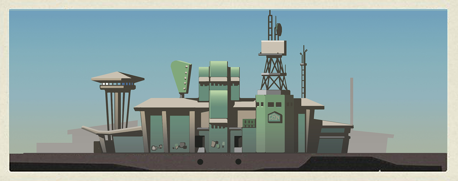
So, when deciding on our refined YLW and GRN styles, we looked for any gaps that weren’t already filled by RED and BLU’s shapes and materials that could still be applied to the same types of industrial settings. We also didn’t want to completely disregard our existing ideas and risk confusing the community. We eventually settled on GRN featuring rounded forms and the cleanest and most modern materials of the bunch, like glass, cast-concrete, and metal framing. That said, we had to make sure they didn’t encroach on Spytech theming. YLW was the trickiest to nail down, but we’ve decided on them using more trapezoidal forms, with grittier, older materials like rusted metal, concrete blocks, and brick.


These refined styles aren’t perfect; there’s an amount of overlap with existing RED and BLU bases that was near-impossible to avoid, but we’re pretty happy with where they’re at for creating a believable and iconic world. Having these more defined but broad guidelines for our Four-Team bases opens up a large range of possibilities for themes and aesthetics, which we’re excited to explore in our future maps.

As more Four-Team maps have been worked on, both internally and externally, we thought it important to really nail down each team’s style of architecture. As you might imagine, though, the over-a-decade of assets and precedent designed specifically around the existence of only two teams made this a challenging feat. Some of the earlier ideas for the YLW and GRN teams’ architecture revolved around more specific, real-world styles like Brutalism and Googie and, while these did make for recognizable looks, they also didn’t quite fit with TF2’s existing approach.

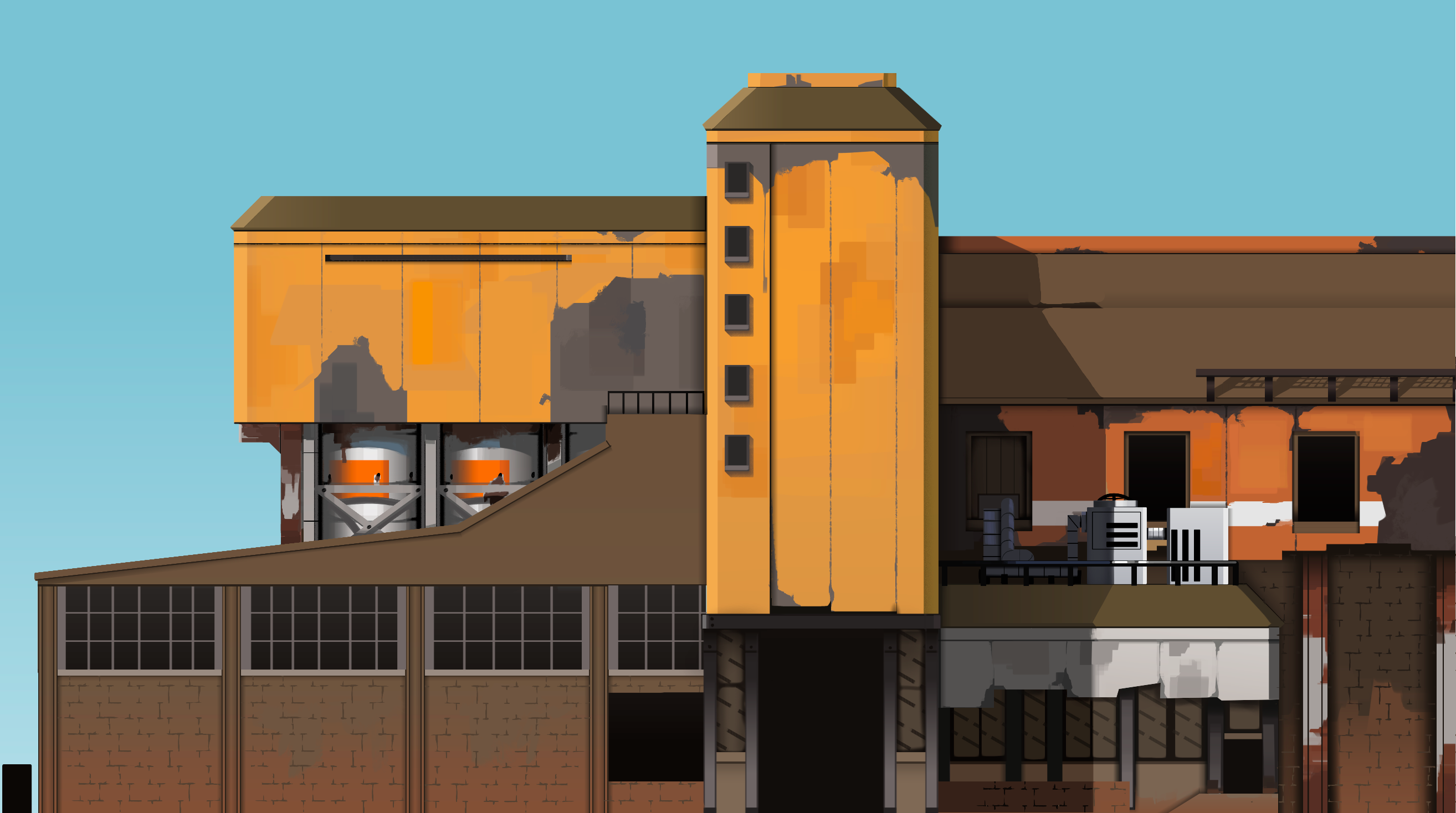
Our previous, less grounded concepts
Even among the earliest maps, the actual styles of RED and BLU bases vary a good deal. Comparing 2Fort and Well’s RED bases provides a good example of that. This is because the original two teams’ looks focus more on big-picture ideas, colors, and shape language over an exact, formulaic approach based on their parent company’s name. The bases also have to fit in the specific context of mid-century, industrial America, and a monolithic, sci-fi radio building isn’t quite what you’d expect to see driving down a country highway.
A concept of a YLW base, halfway through our designs
So, when deciding on our refined YLW and GRN styles, we looked for any gaps that weren’t already filled by RED and BLU’s shapes and materials that could still be applied to the same types of industrial settings. We also didn’t want to completely disregard our existing ideas and risk confusing the community. We eventually settled on GRN featuring rounded forms and the cleanest and most modern materials of the bunch, like glass, cast-concrete, and metal framing. That said, we had to make sure they didn’t encroach on Spytech theming. YLW was the trickiest to nail down, but we’ve decided on them using more trapezoidal forms, with grittier, older materials like rusted metal, concrete blocks, and brick.
Some images of our yet-to-be-released, Flask-based style guide
These refined styles aren’t perfect; there’s an amount of overlap with existing RED and BLU bases that was near-impossible to avoid, but we’re pretty happy with where they’re at for creating a believable and iconic world. Having these more defined but broad guidelines for our Four-Team bases opens up a large range of possibilities for themes and aesthetics, which we’re excited to explore in our future maps.
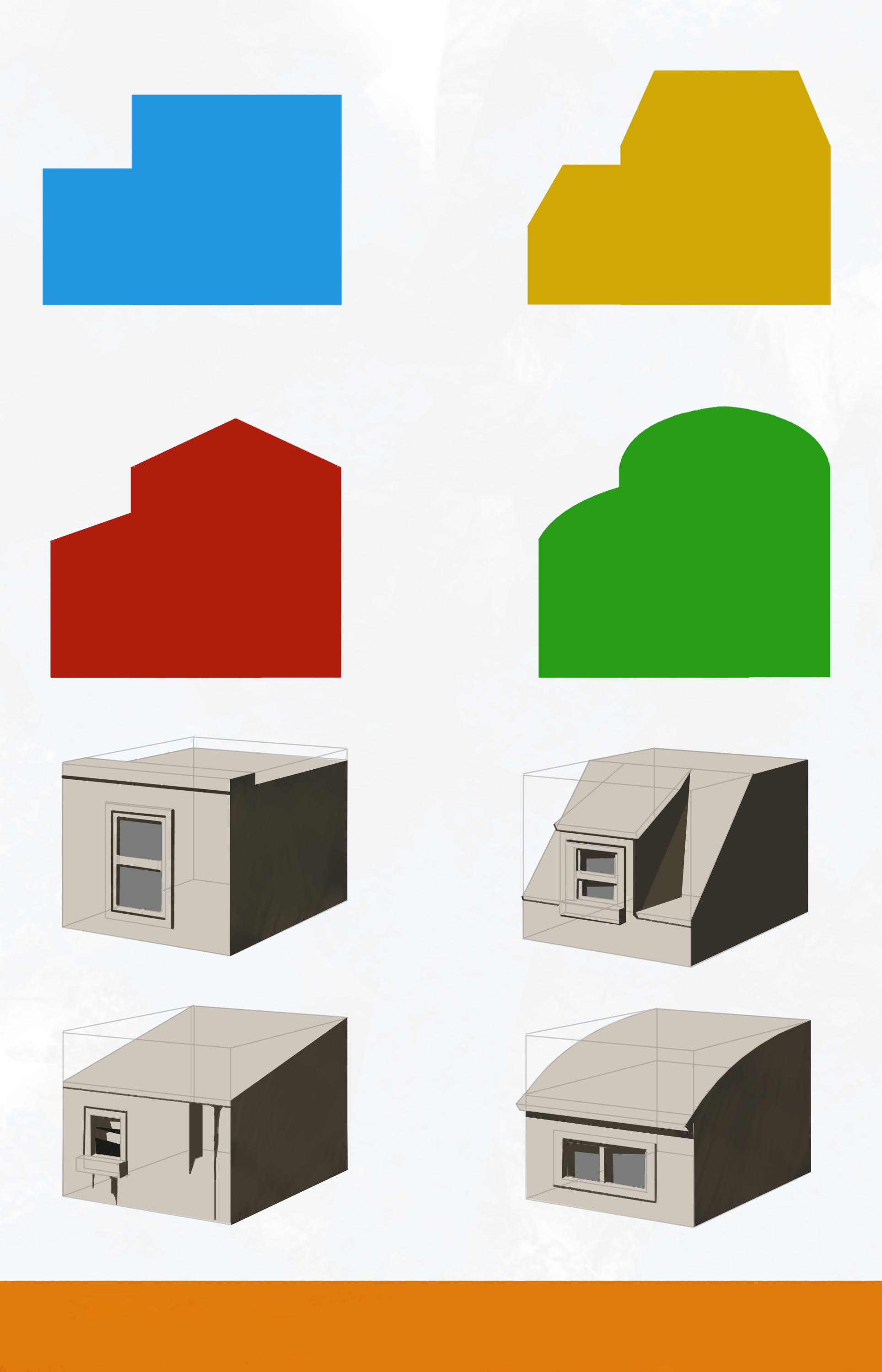
Our finalized shape language chart
 Back
Back